Evolving Global Shares Design System

Role
Product Designer
Timeline
Jan ~ Jul 2023
Tools
Figma, Miro, Confluence
About the company
Global Shares is a leading global fintech company with their cloud based platform that provides equity management solutions to corporate clients and their employees in 100+ countries worldwide.
Project context
Their Software platform provides services such as trading, financial reporting, business intelligence reporting, global compliance, employee portal, capitalisation table management and scenario modelling.
Forge Design System:
- Being used at Admin Platform 💻
- Foundations applied, detached on Mobile App 📱
- To start being used on full platform redesign on Employee Portal 💻 📱
Issues
- A non unified solution
- No process to review design implemented
- Duplicated design documents
- No versioning process
- No governance model
- No documentation process
- Inability to work on current components
- Accessibility Issues
- Broken components
- Components not attending product necessities
- No multi-branding support
- Full platform redesign in progress
Goals and approach
Considering the urgency surrounding the ongoing platform redesign, we decided working in two phases: Phase 1 (Forge Light) to organize everything we had, Phase 2 (Forge Anvil) to be the DS evolution, with full redesign from ground up.
Address urgent needs related to the ongoing platform redesign
Having a design system that attends all products complex necessities
Attend accessibility mandatory requests following JPMorgan acquisition
Timeline and process
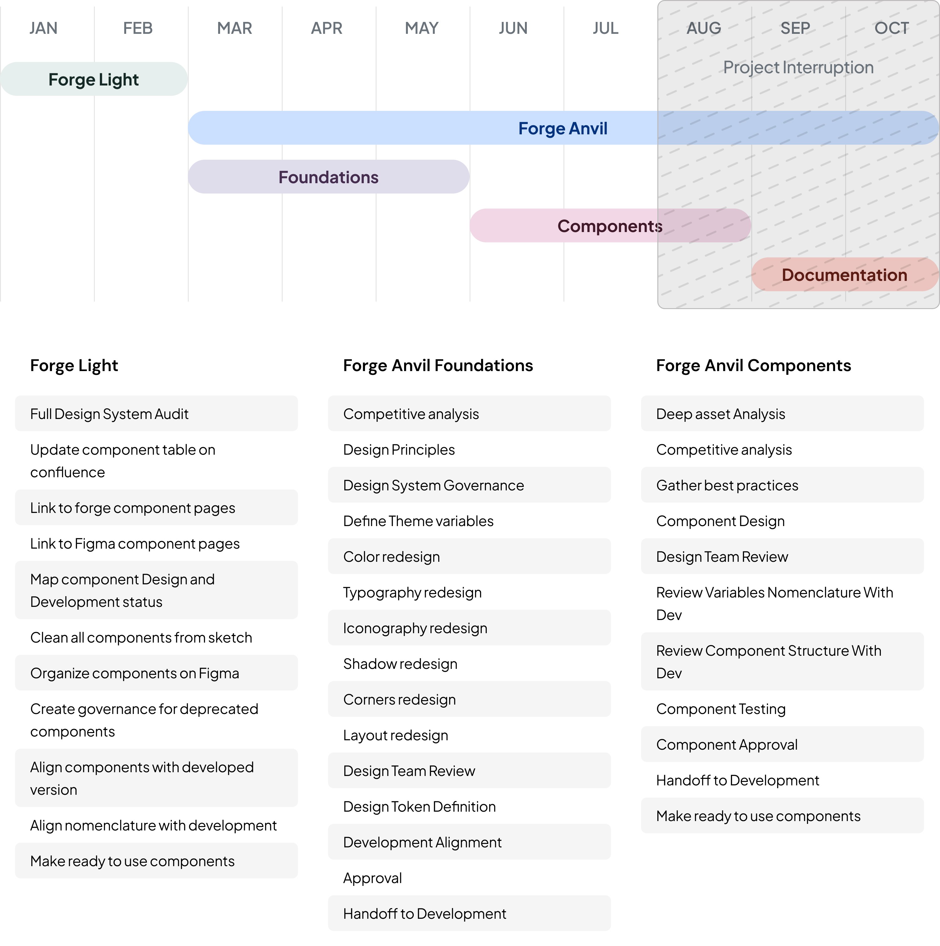
Forge Light
Before
- 🚫 No organization
- 🚫 Inconsistent with dev
- 🚫 Broken Components
After
- ✅ Ready to use components
- ✅ Design <> Dev alignment tags
- ✅ Storybook Links
Forge Anvil
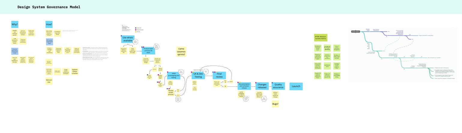
In the second phase of our design system, we began by analyzing and compiling the research previously conducted into actionable insights and governance definitions.
By establishing governance definitions, we ensured that decision-making, maintenance, and future updates would be consistent, organized, and aligned with the overall vision of the design system.
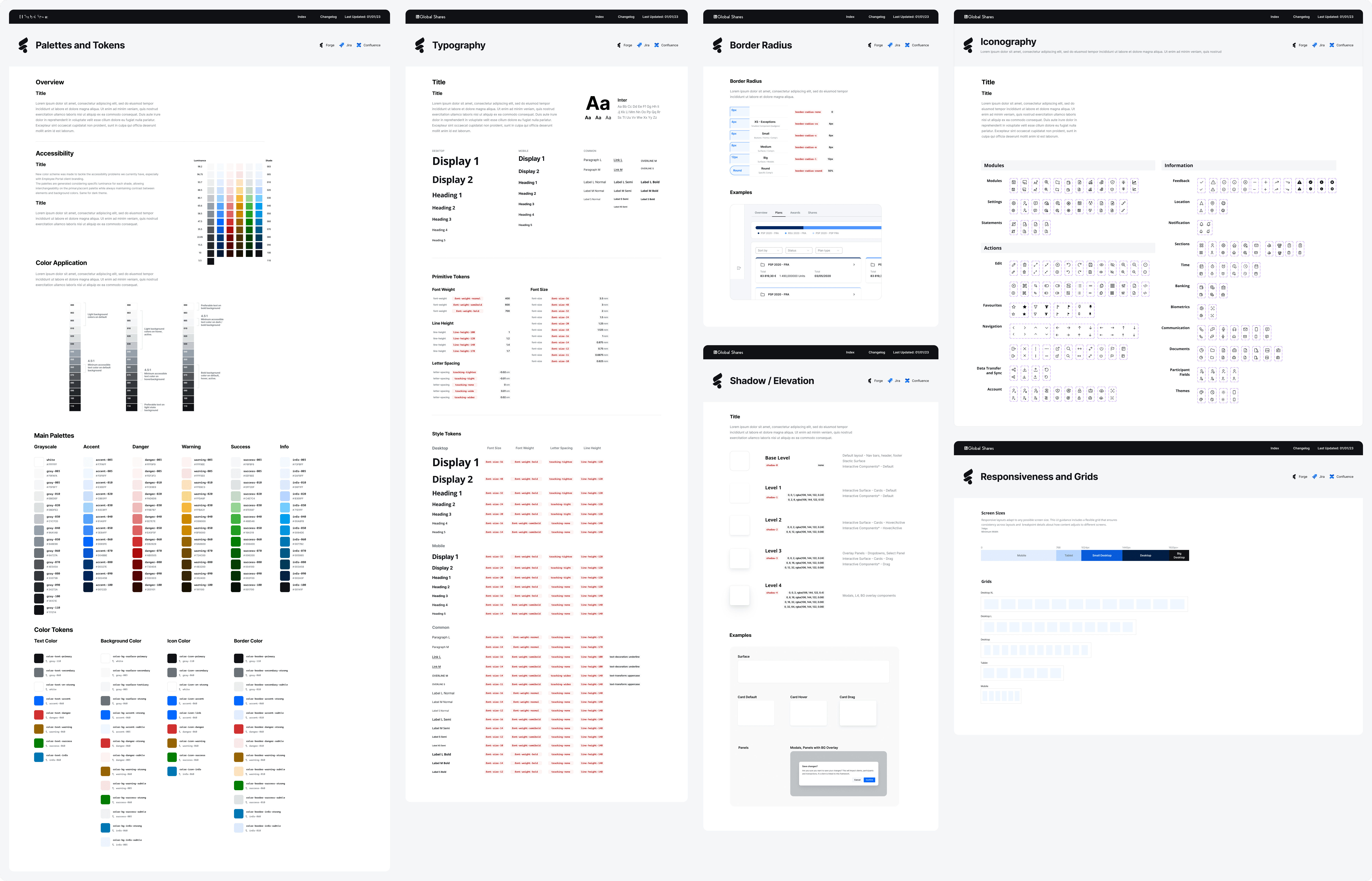
Foundations
The foundations of our design system were built on insights gathered from an in-depth analysis of 20+ industry-leading design systems. Key elements include design tokens, colors, grid systems, typography, border radius, shadows and iconography.
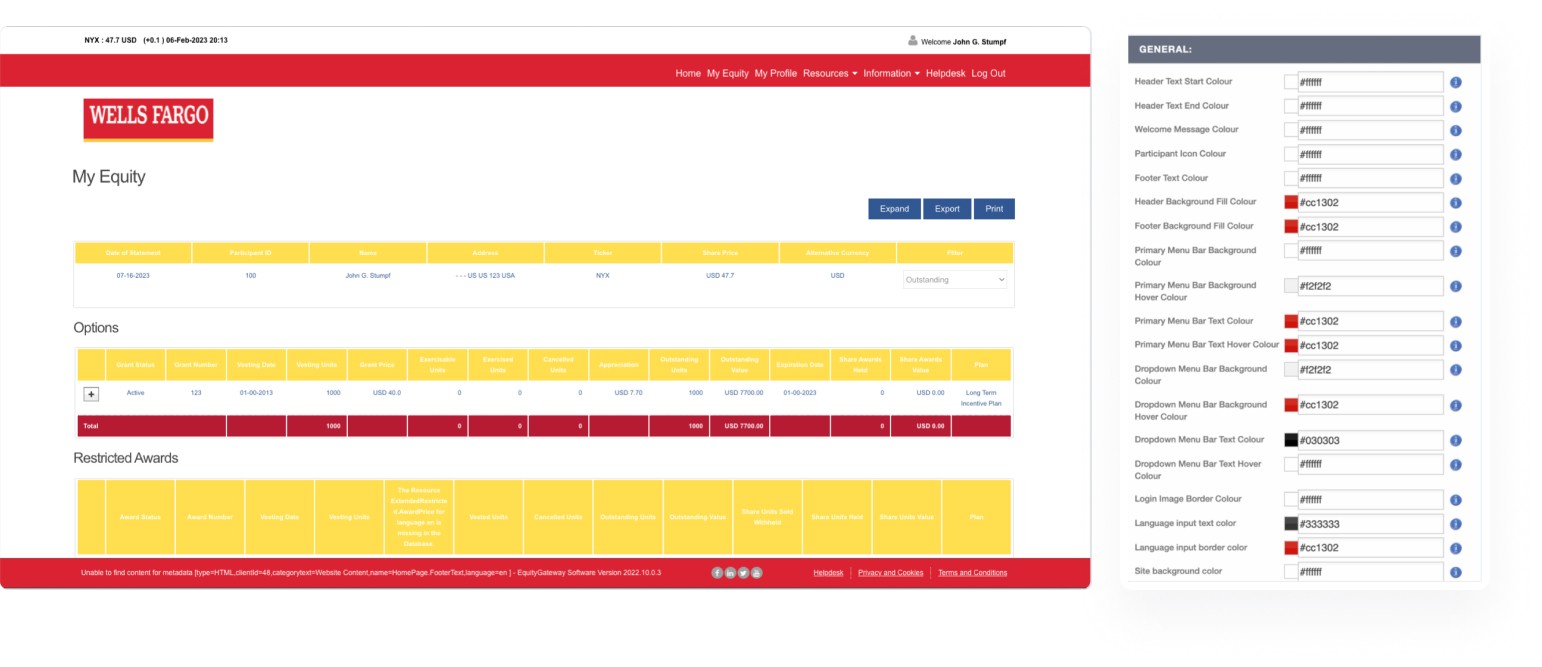
Color Accessibility on Theming
One of the main goals of the project were being in compliance with accessibility standards. The old settings for the employee view, alongside with not having a previewing of the final results, had also no contrast check between colors.
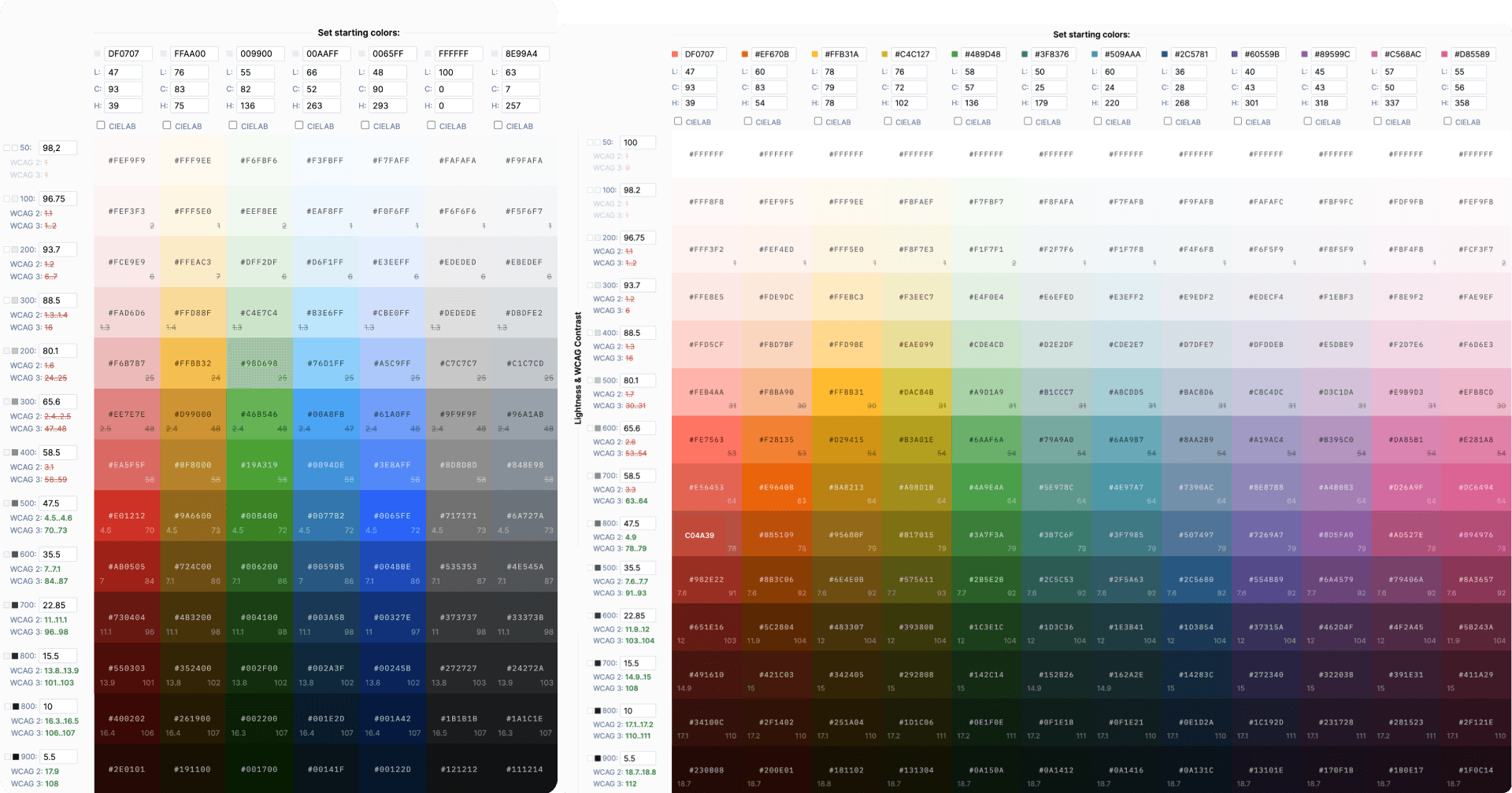
Palettes based on luminance
A color system based on luminance ensures consistent contrast across multiple themes by anchoring colors to their relative brightness levels rather than fixed hues. This approach guarantees that text and UI elements remain legible and accessible.
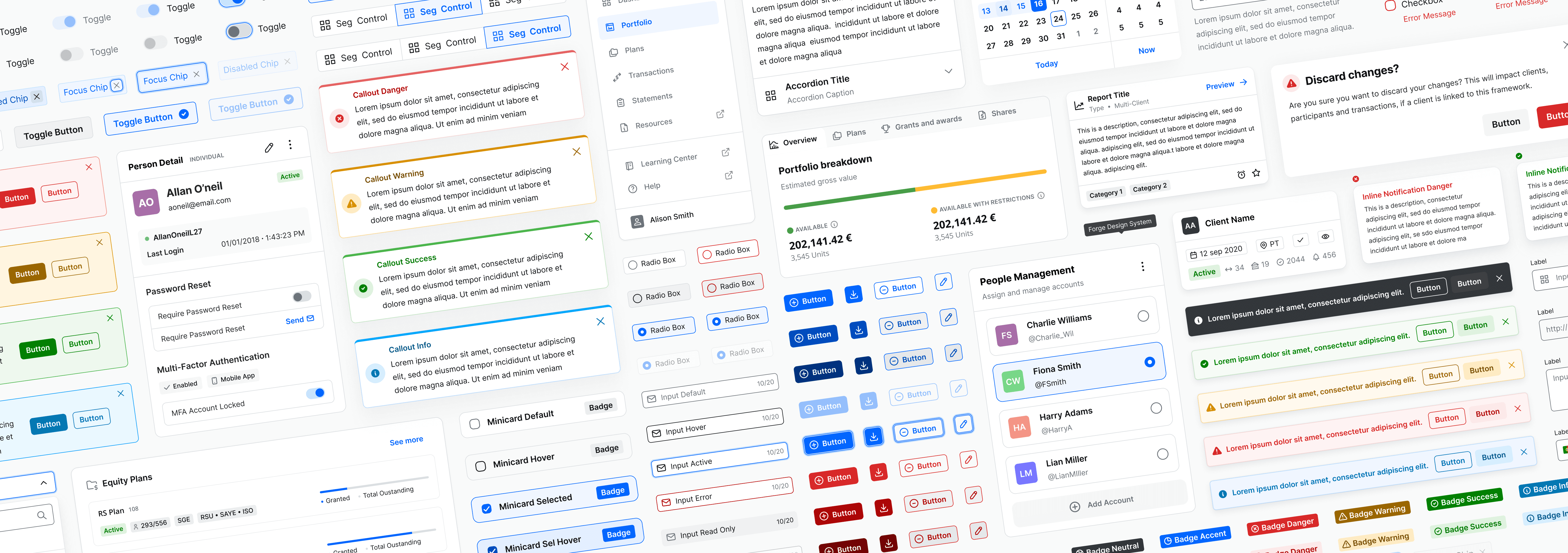
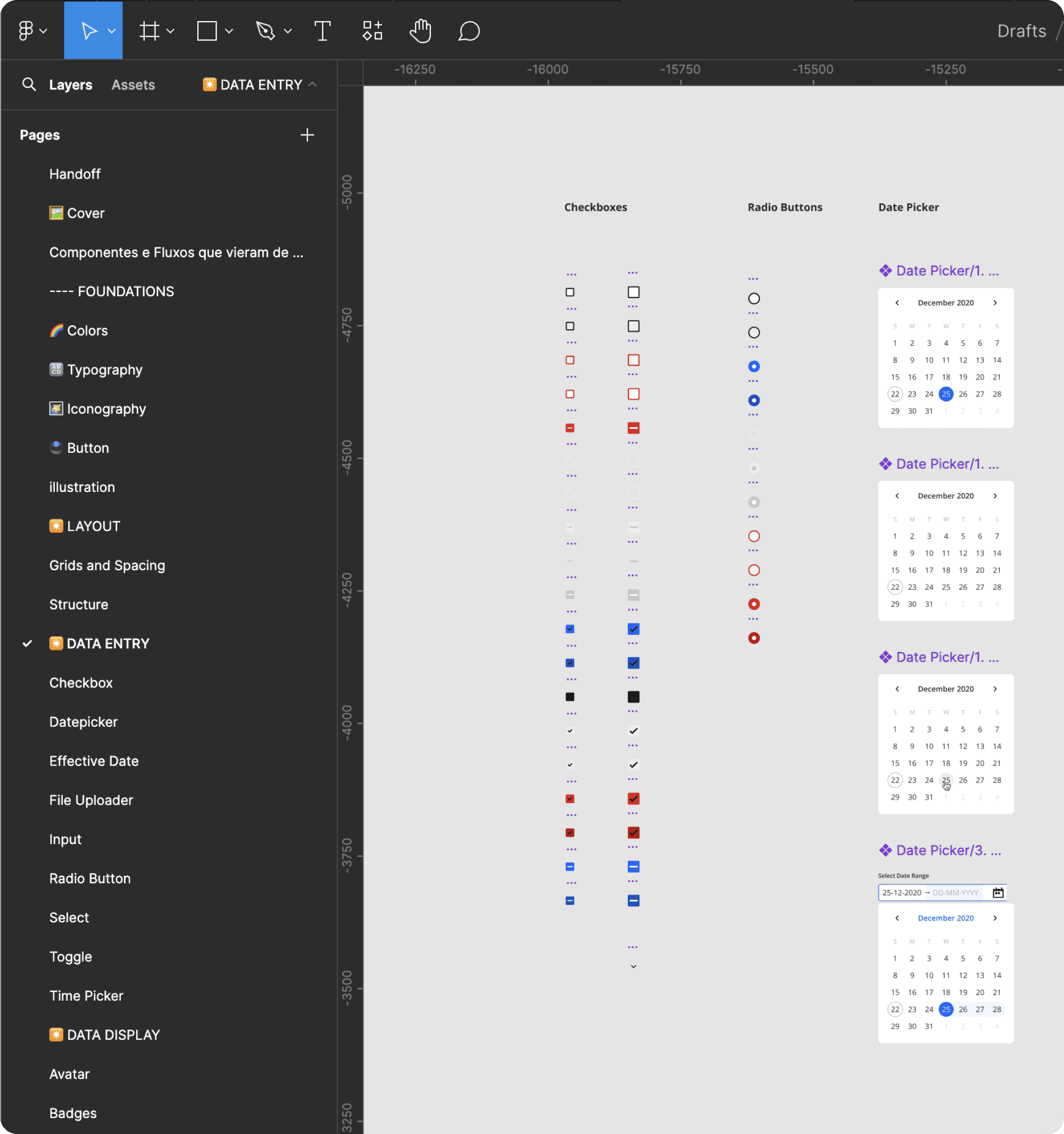
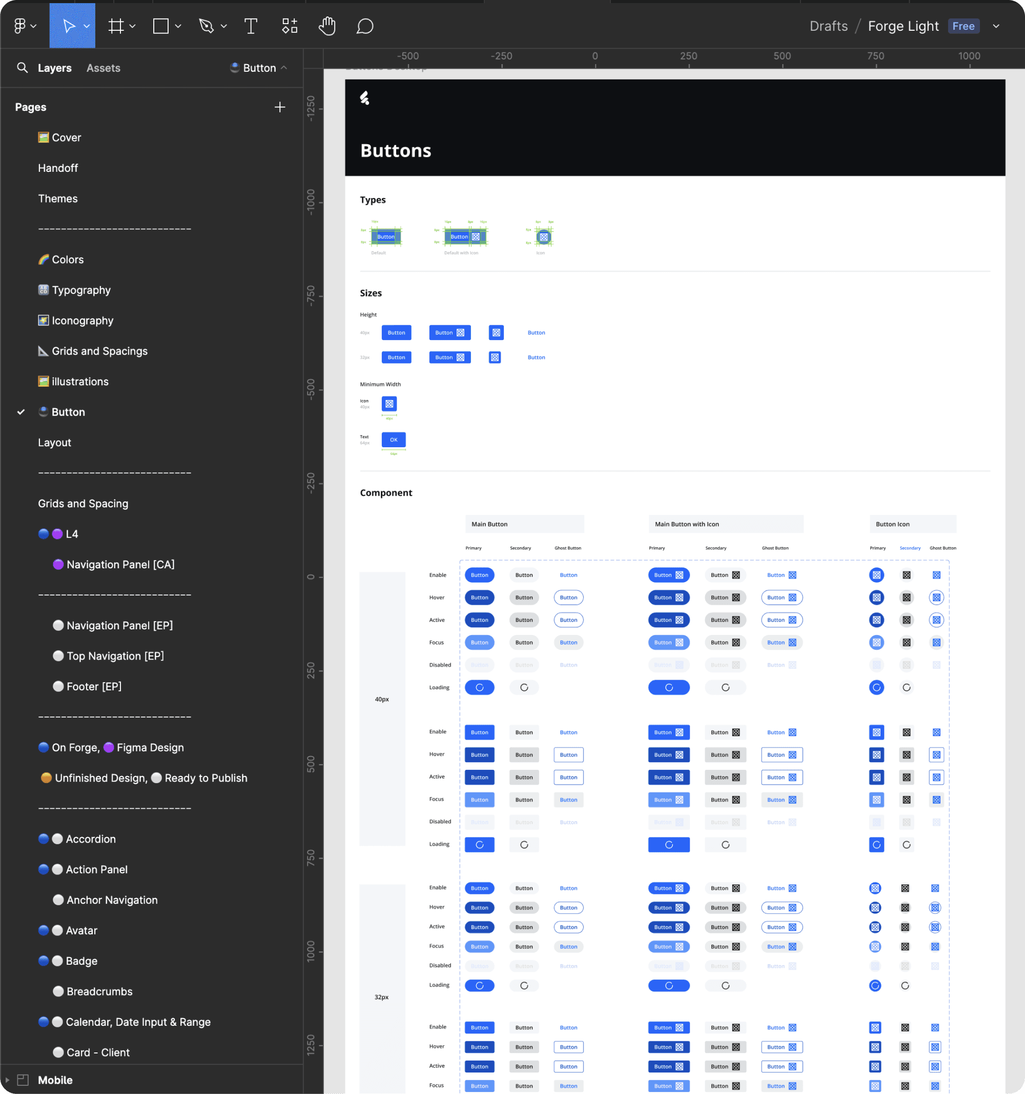
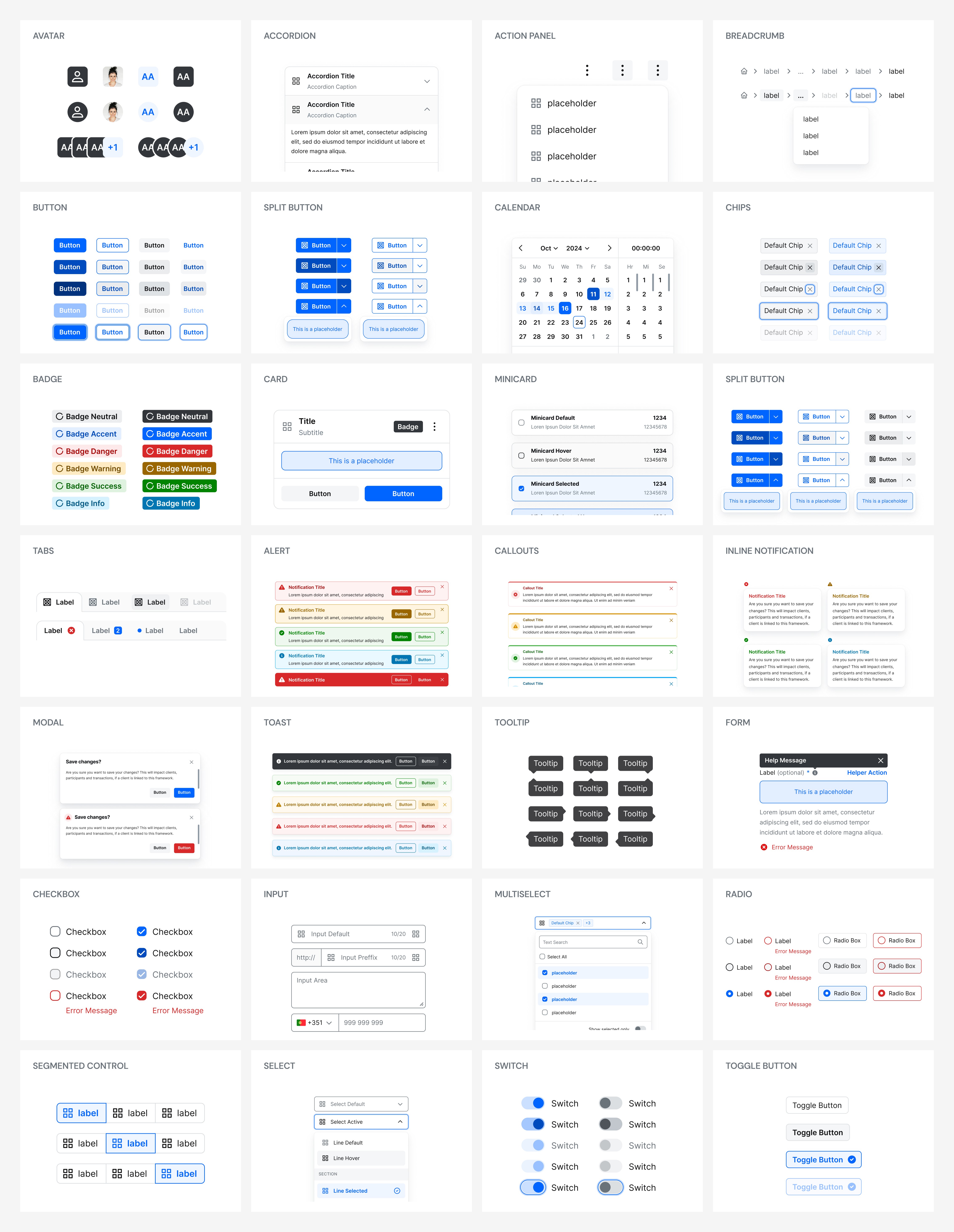
Building components
A robust component variable system was developed in Figma to cater to the needs of both designers and developers.
Components also underwent a rigorous quality checklist to ensure they meet the highest standards of functionality, accessibility, and usability.
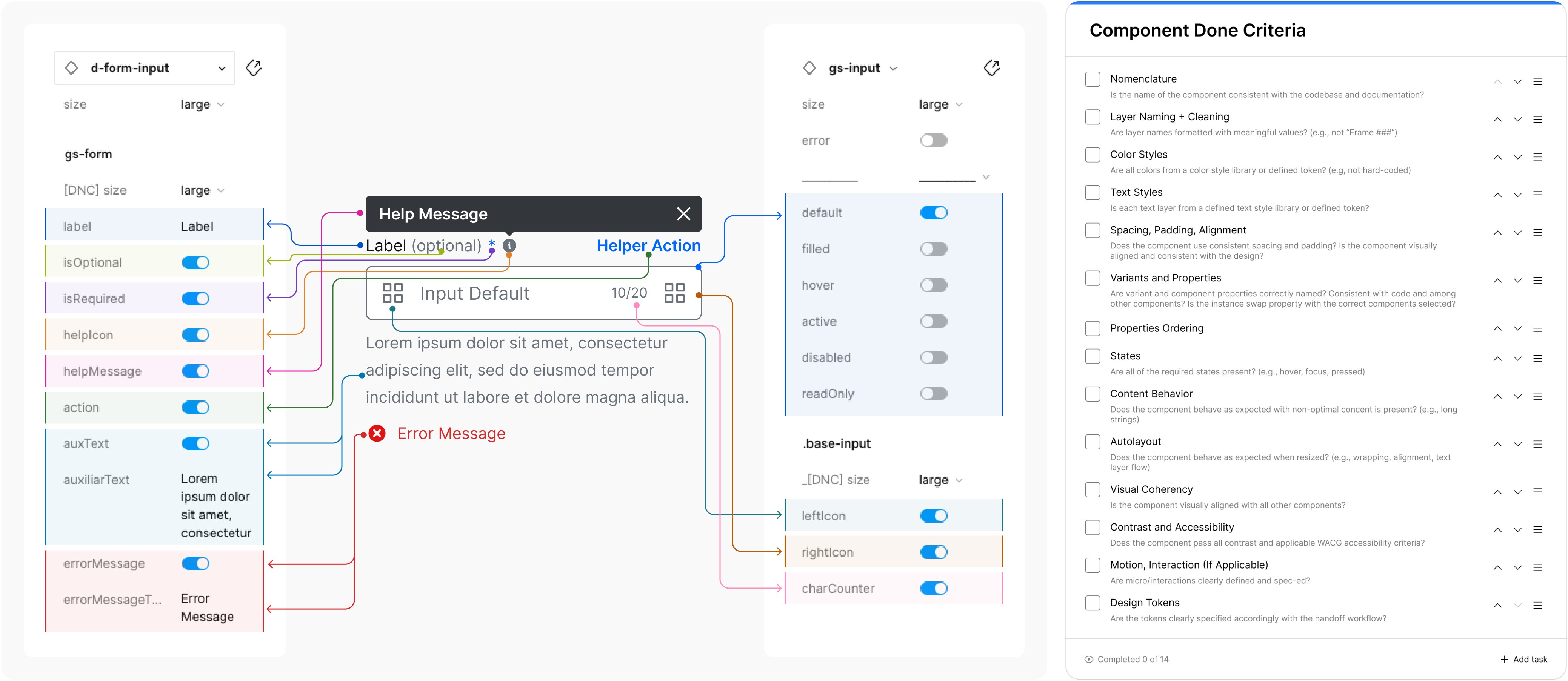
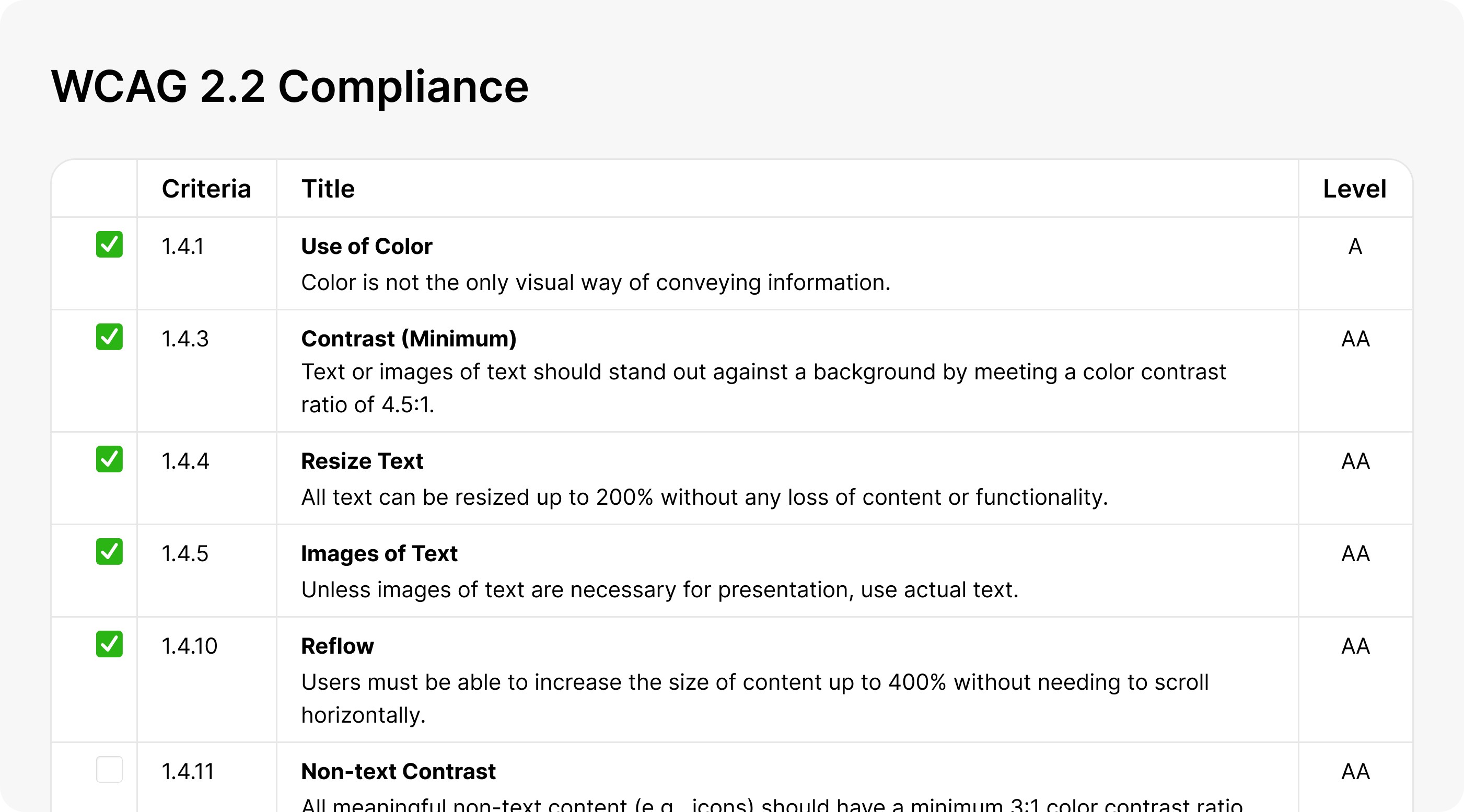
WCAG 2.2 Compliance
Every component in our design system is meticulously crafted to adhere to WCAG (Web Content Accessibility Guidelines) compliance, ensuring accessibility for all users regardless of their abilities.
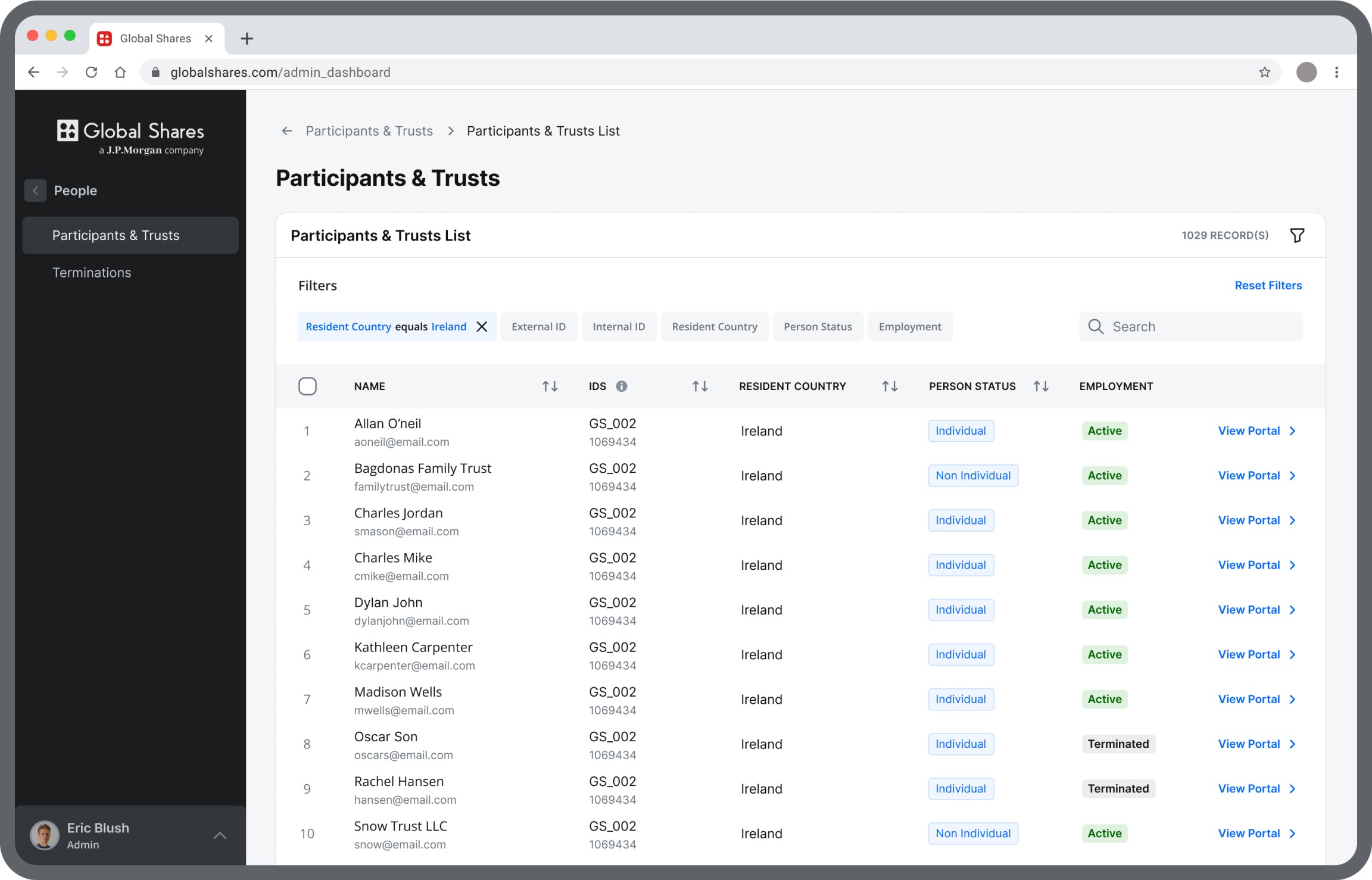
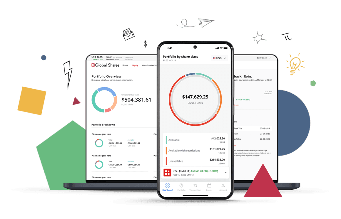
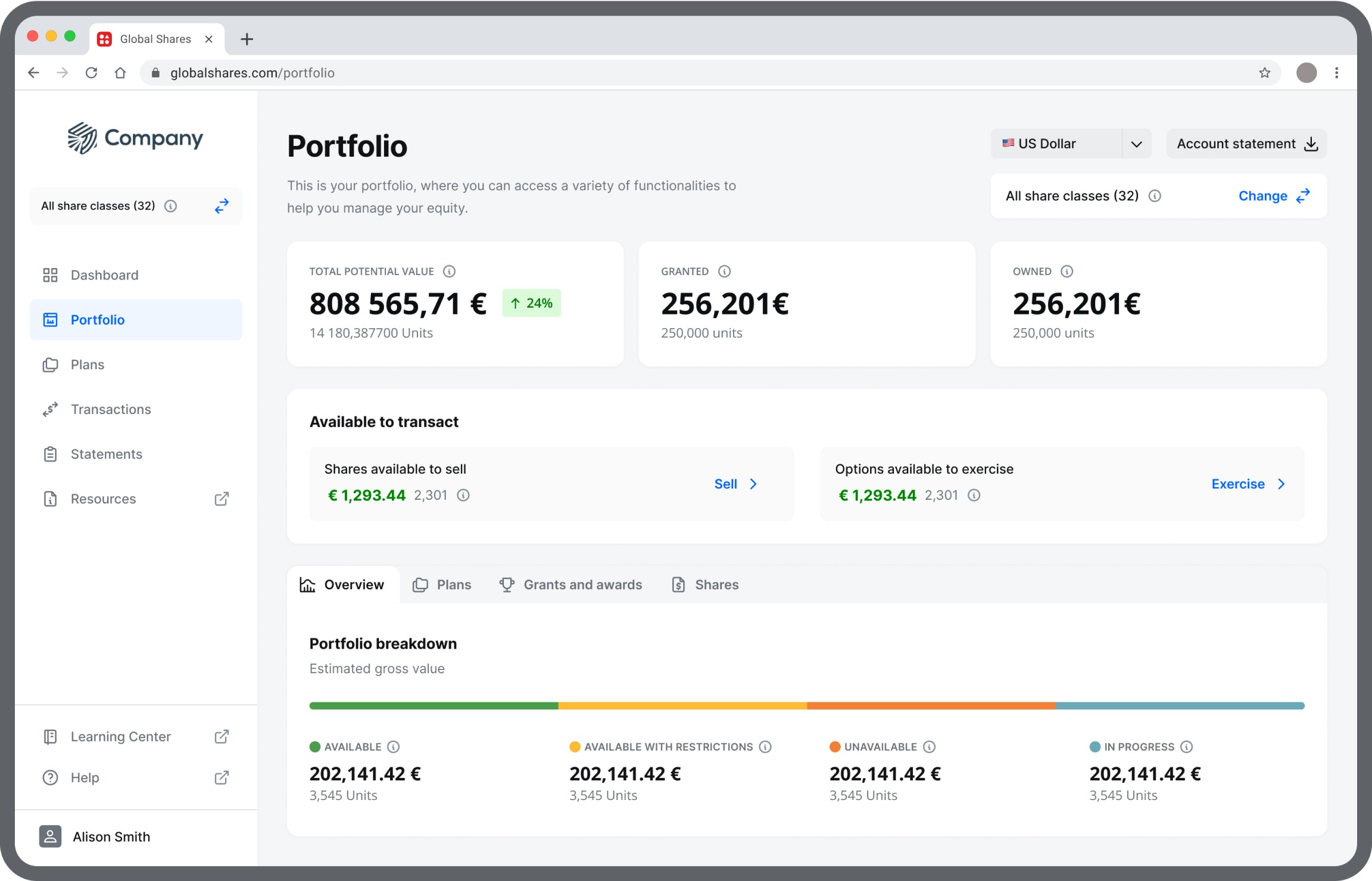
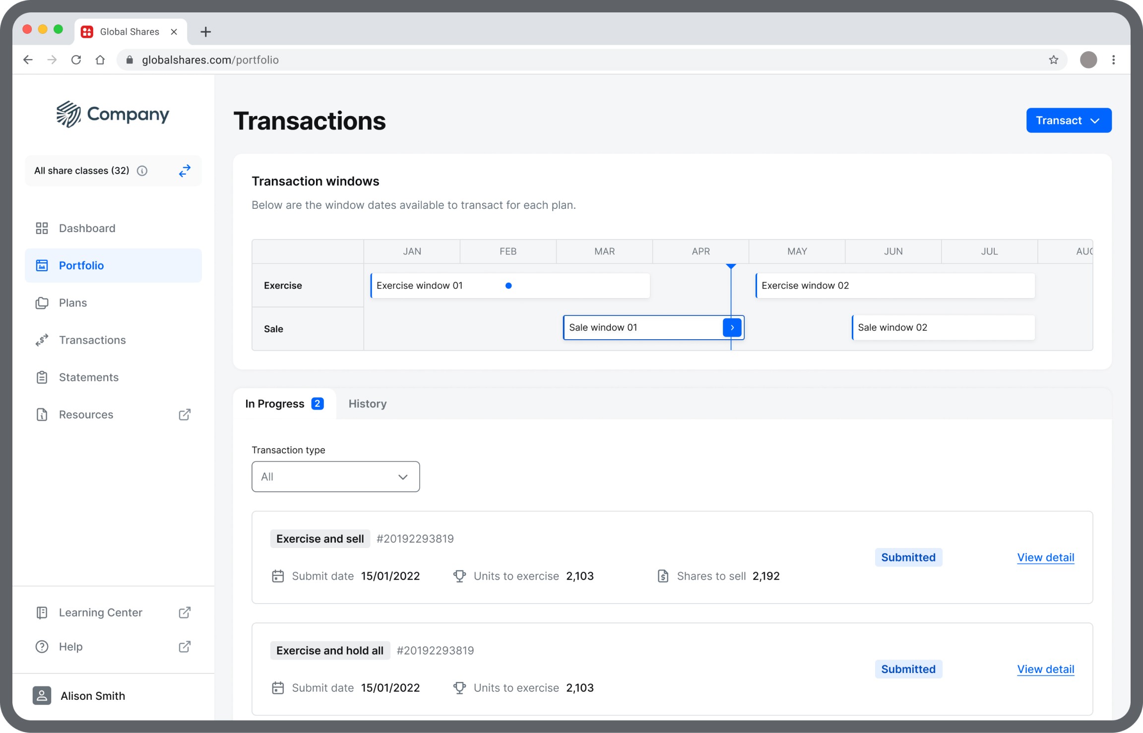
Screen Examples
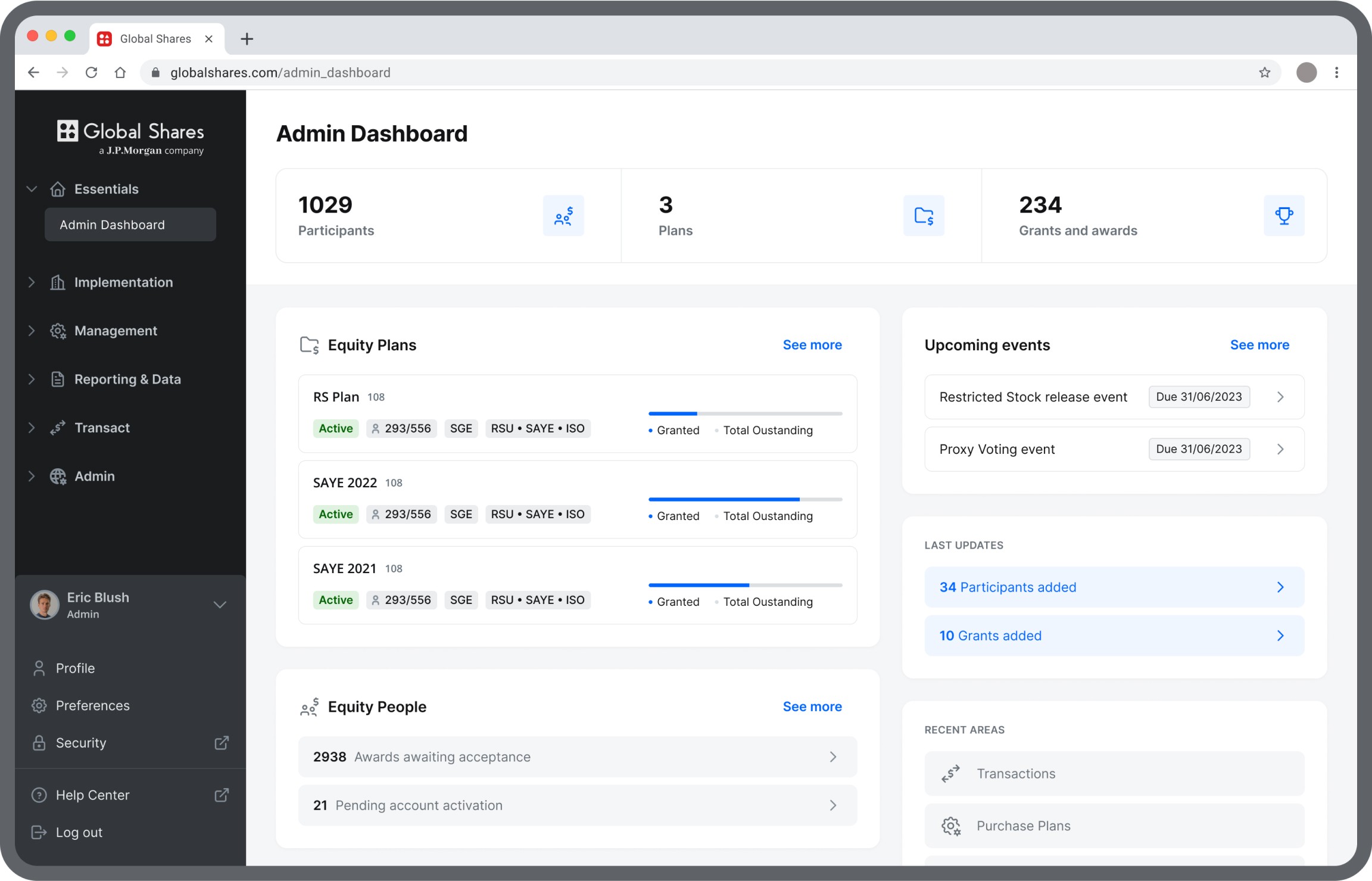
After JPMorgan acquired Global Shares, the development of the Global Shares design system and associated products was halted due to a realignment of business priorities.
This unexpected interruption left the project unfinished, but it highlighted the significant progress made in creating a cohesive, scalable, and accessible design foundation.